A trustworthy storefront in a skeptical category
Vape retail website and subscription shopping experience
Vape Dojo is a long standing vape retailer founded in 2011 with a mission to offer high quality gear, premium juice blends and competitive pricing through a clean, easy to use digital experience. After years of growth, multiple retail locations and the launch of a state of the art juice lab, they needed a modern website that matched their reputation for quality and reliability. The brand wanted to move away from outdated, hard to navigate vape sites and provide customers with a trusted, streamlined way to shop, explore flavors and learn about their products.
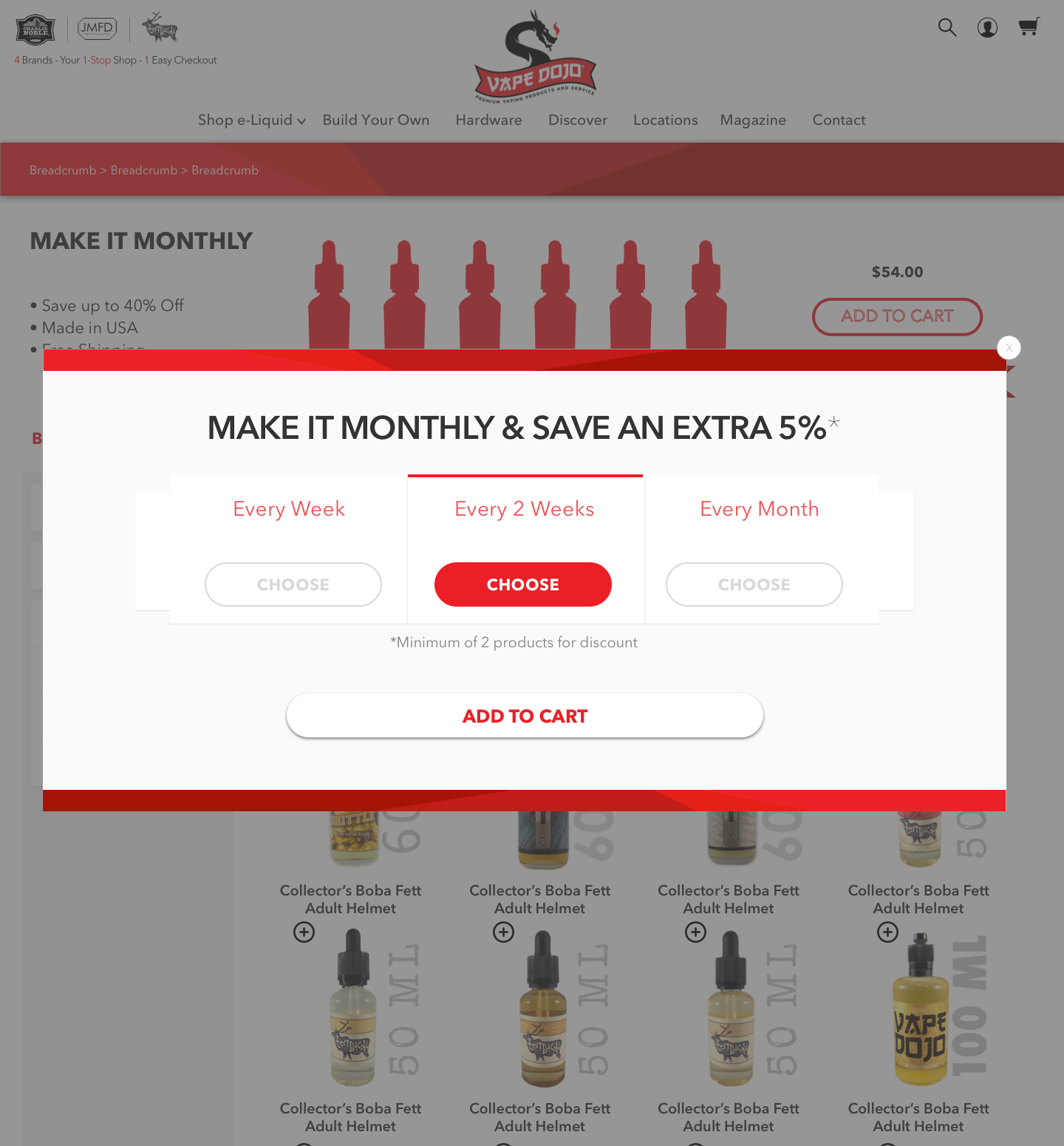
I led project management, UX design and development oversight for their full website redesign. I created wireframes, navigation structures and product flows focused on clarity, ease of shopping and customer retention. I also helped design their Subscribe and Save experience, allowing customers to set delivery schedules and receive automatic discounts on recurring orders. The final site delivers a polished, user-friendly e‑commerce experience that highlights Vape Dojo's premium juice line, competitive pricing and strong customer service.

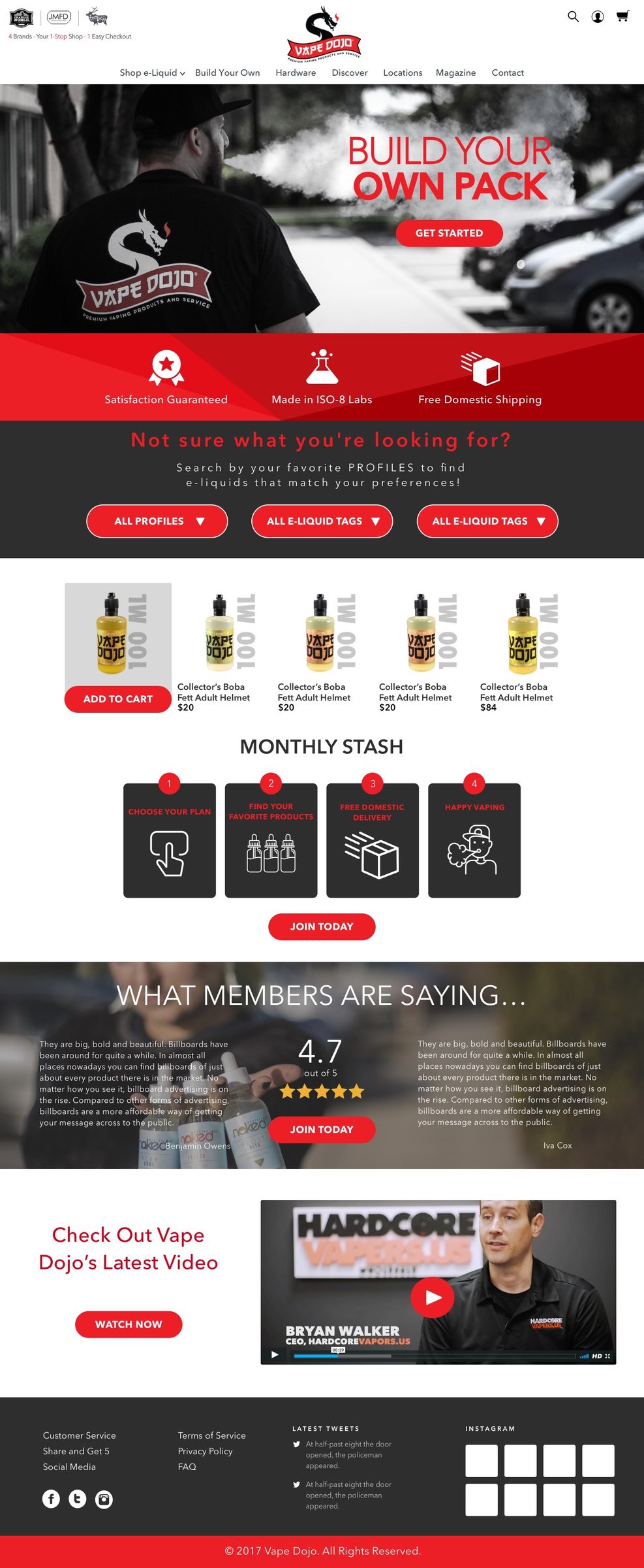
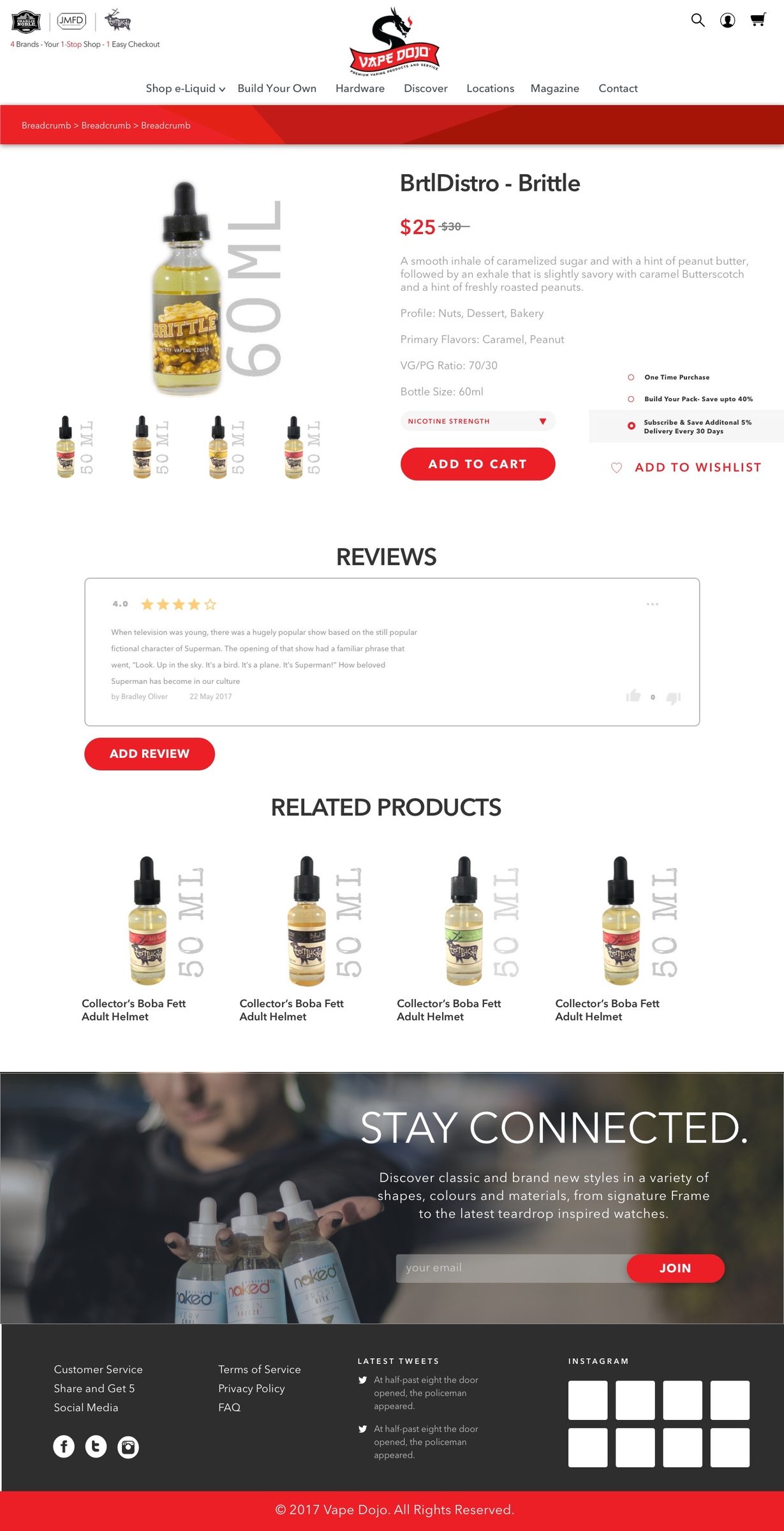
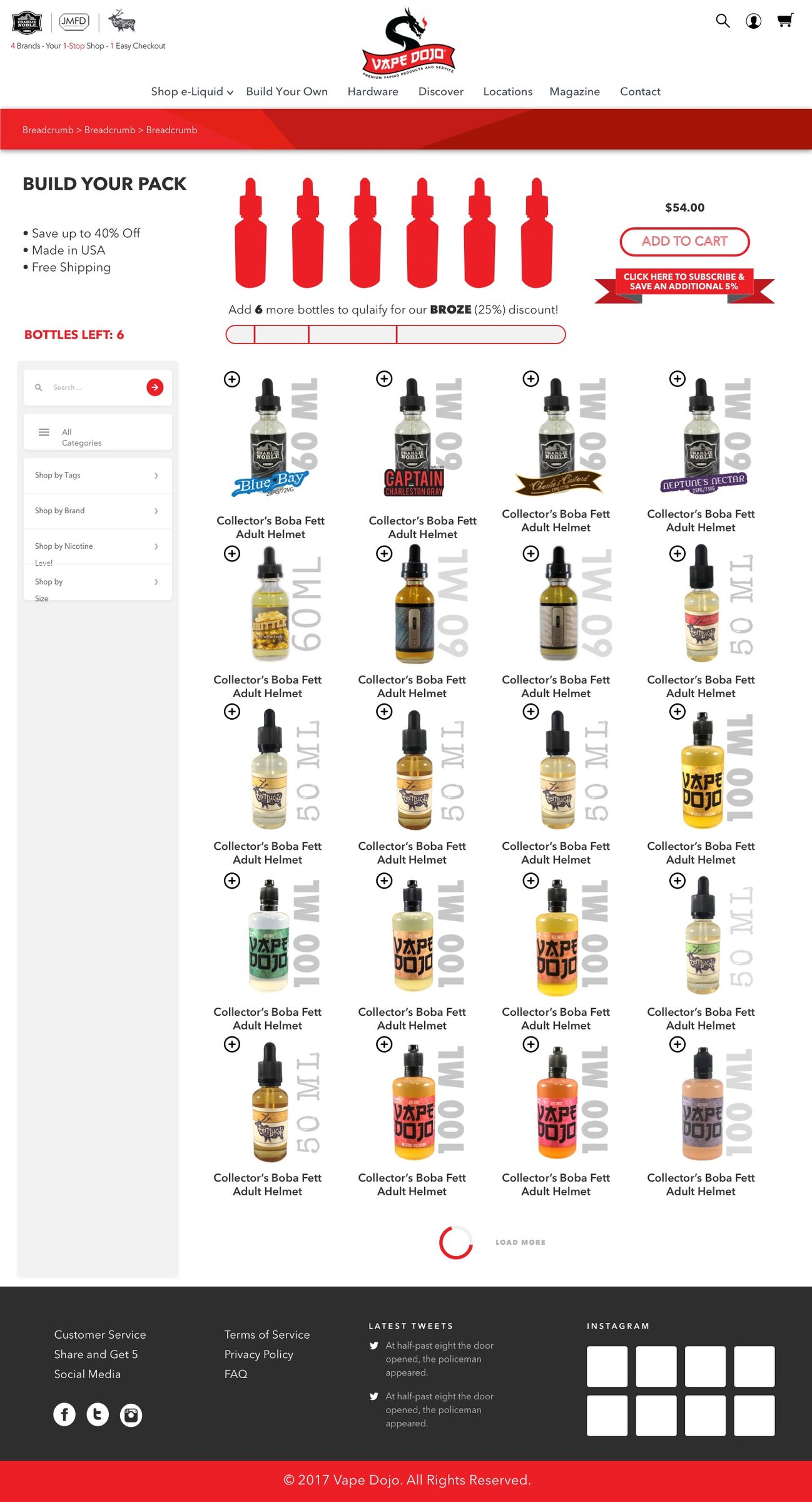
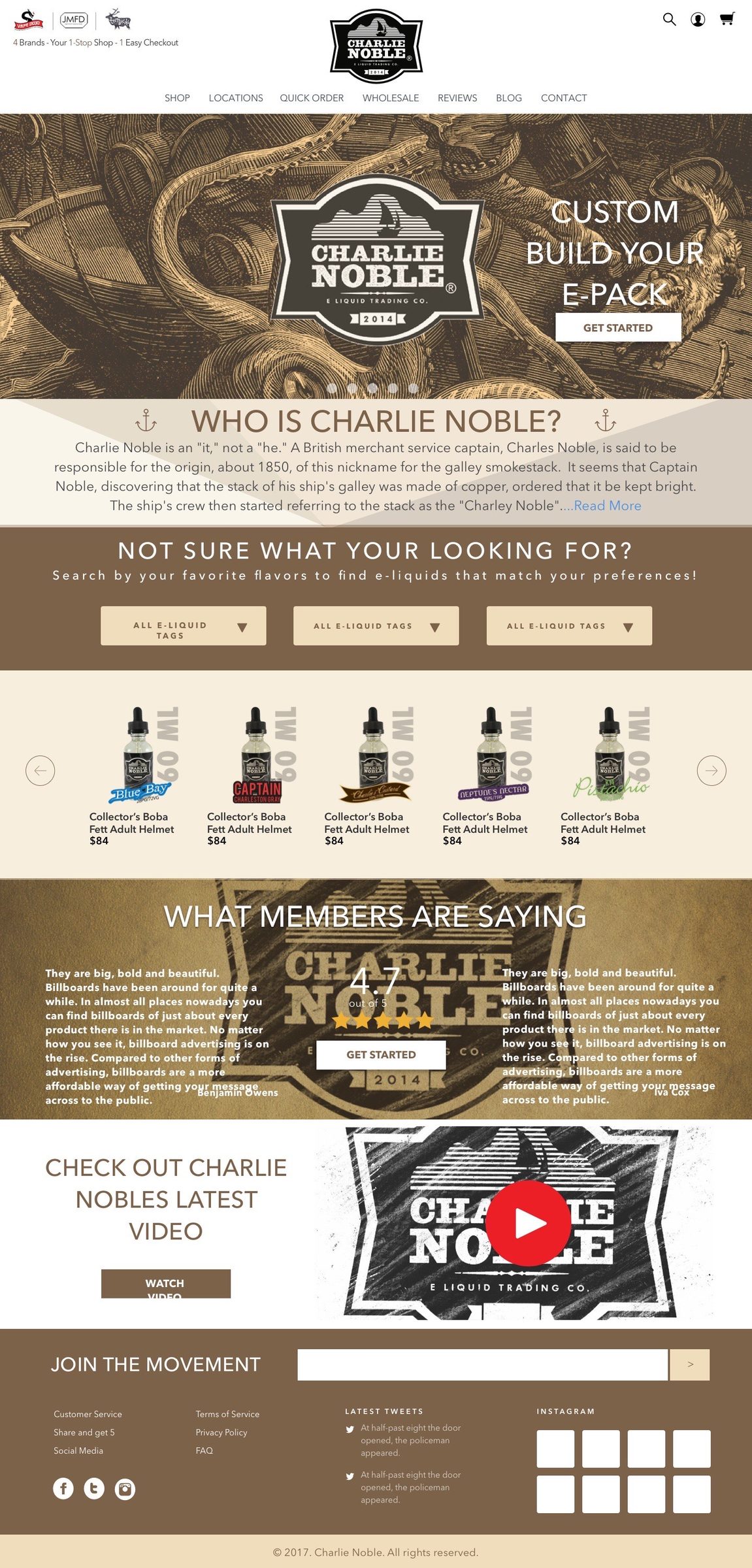
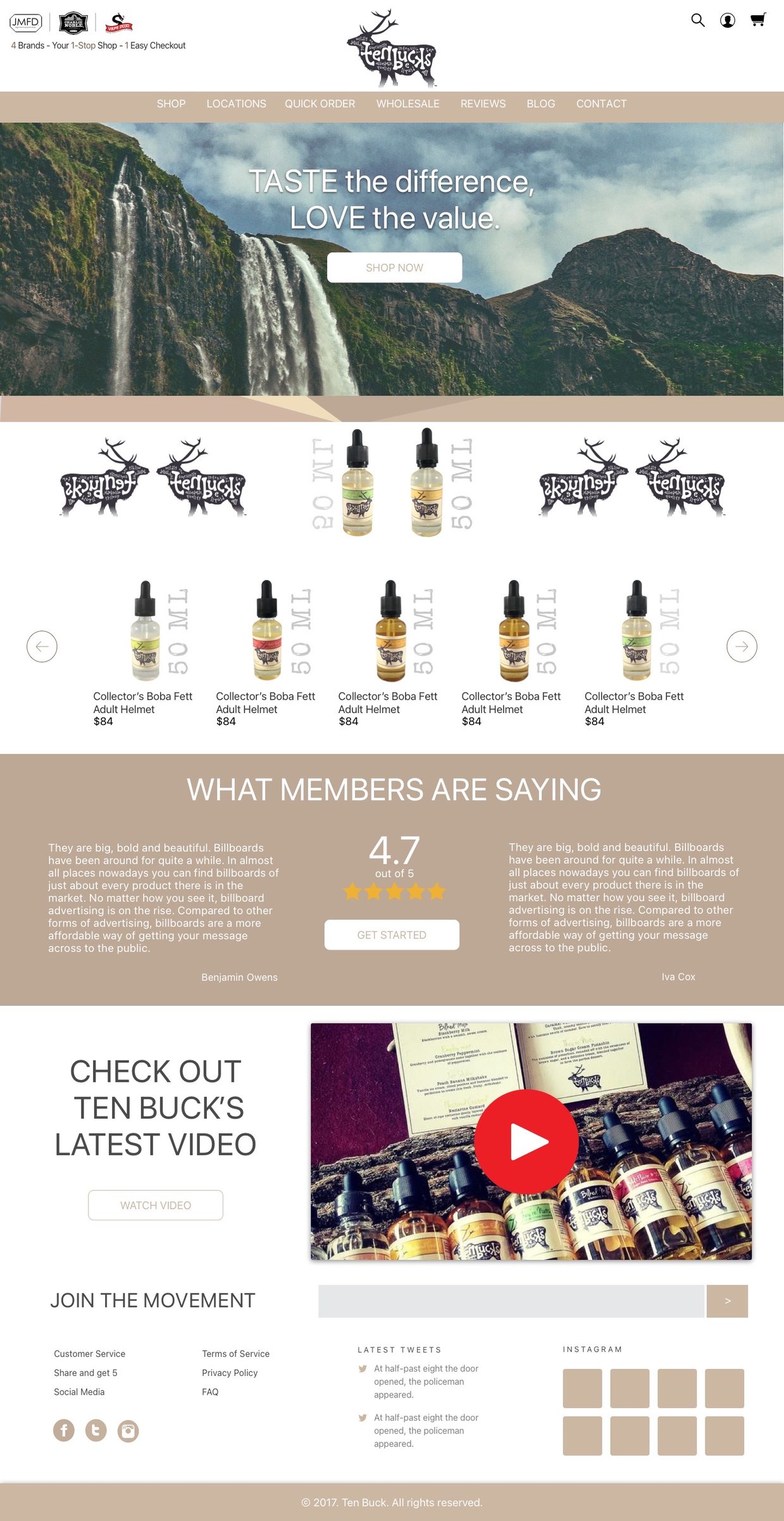
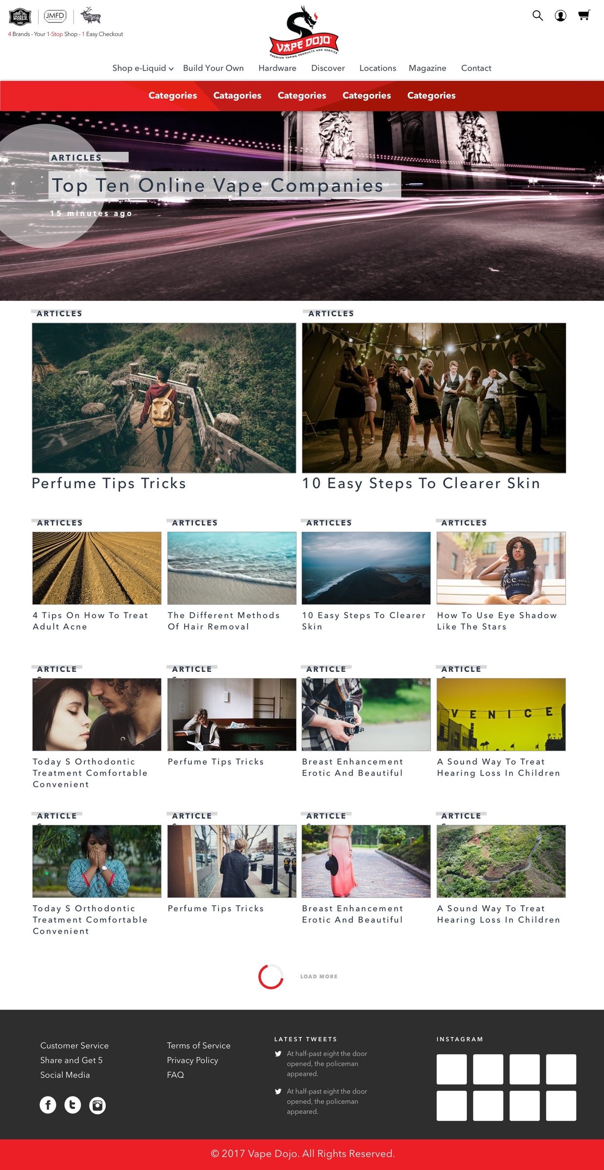
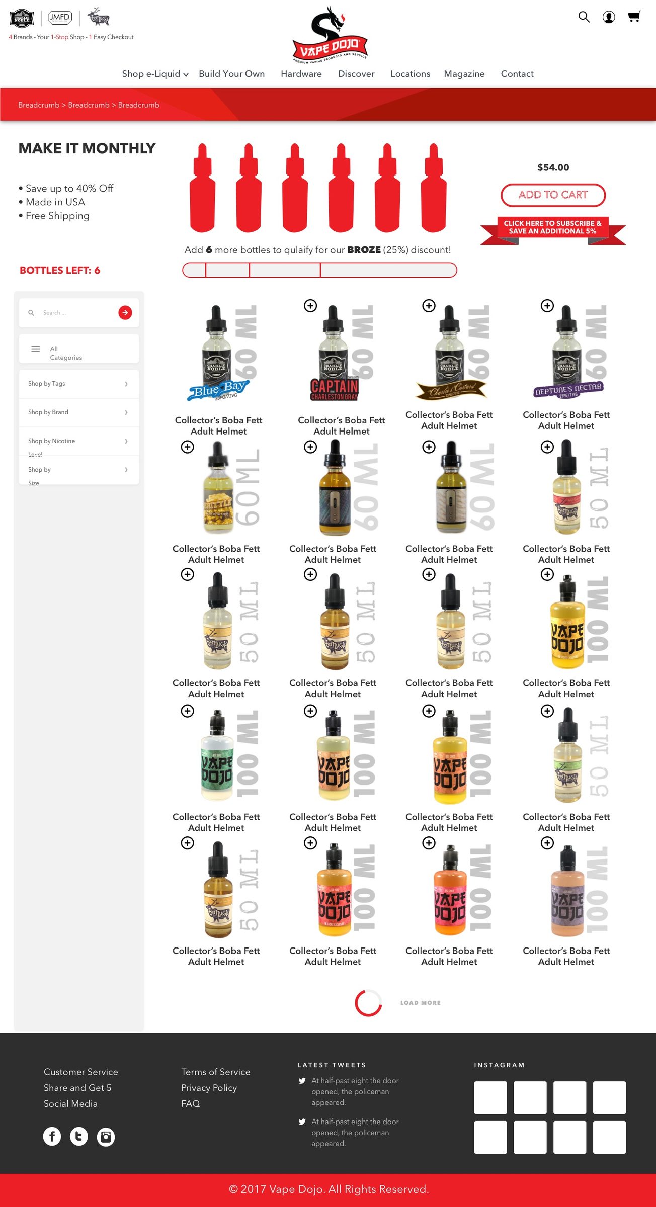
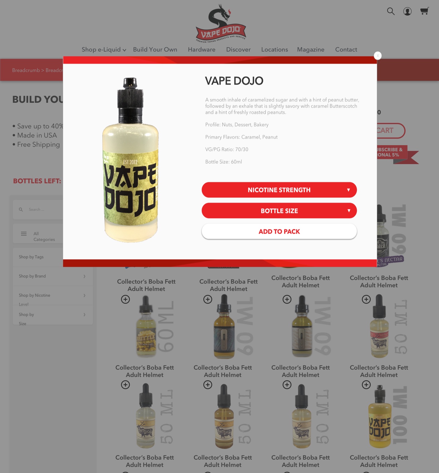

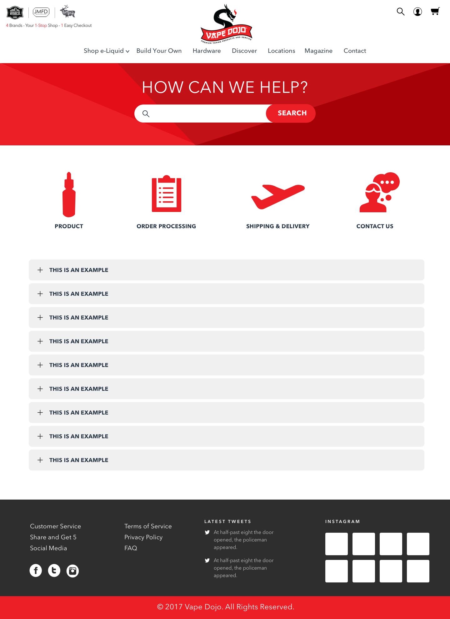
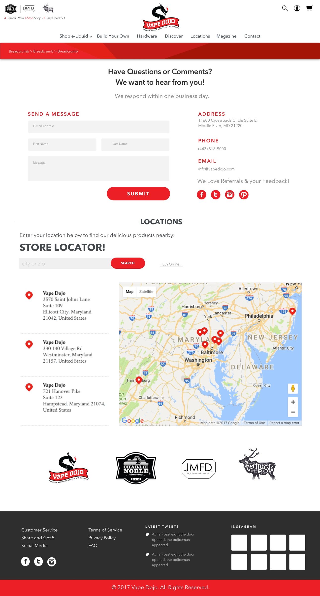
The Vape Dojo identity is a dragon-and-ribbon lockup with a brush-drawn logotype, carried by a tight palette of dragon red (#ED1F24, with UI reds #E40E18 and #C21117), charcoal (#2E2E2E), light gray (#DCDCDC) and white. The same dragon and ribbon system extends to the Dojo Delivers fulfillment mark. On the site, headings and interface labels run in an uppercase geometric sans with wide tracking, and every session begins at a full-screen “Adults Only (18+)” age-verification gate before any storefront page renders.
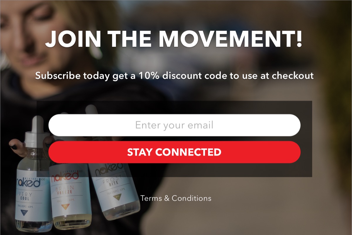
Because this is an age-restricted retail category, the boards below document the design system itself rather than promotional material — the real logo files, palette hexes sampled from the logo and page designs, and the site's navigation and screen inventory taken verbatim from the designed pages.
